Introducing the ACA: Structural Science Society!
The American Crystallographic Association has a long and incredible history. Formed in 1949 by a merger of the Crystallographic Society of America and the American Society for X-ray and Electron Diffraction, the ACA promotes the study of the arrangement of atoms in matter. Even in the group’s first form, we wanted to offer a "home" for chemists, mineralogists, and physicists and now, more than fifty years later, the ACA is still evolving to welcome all structural science disciplines to the society.
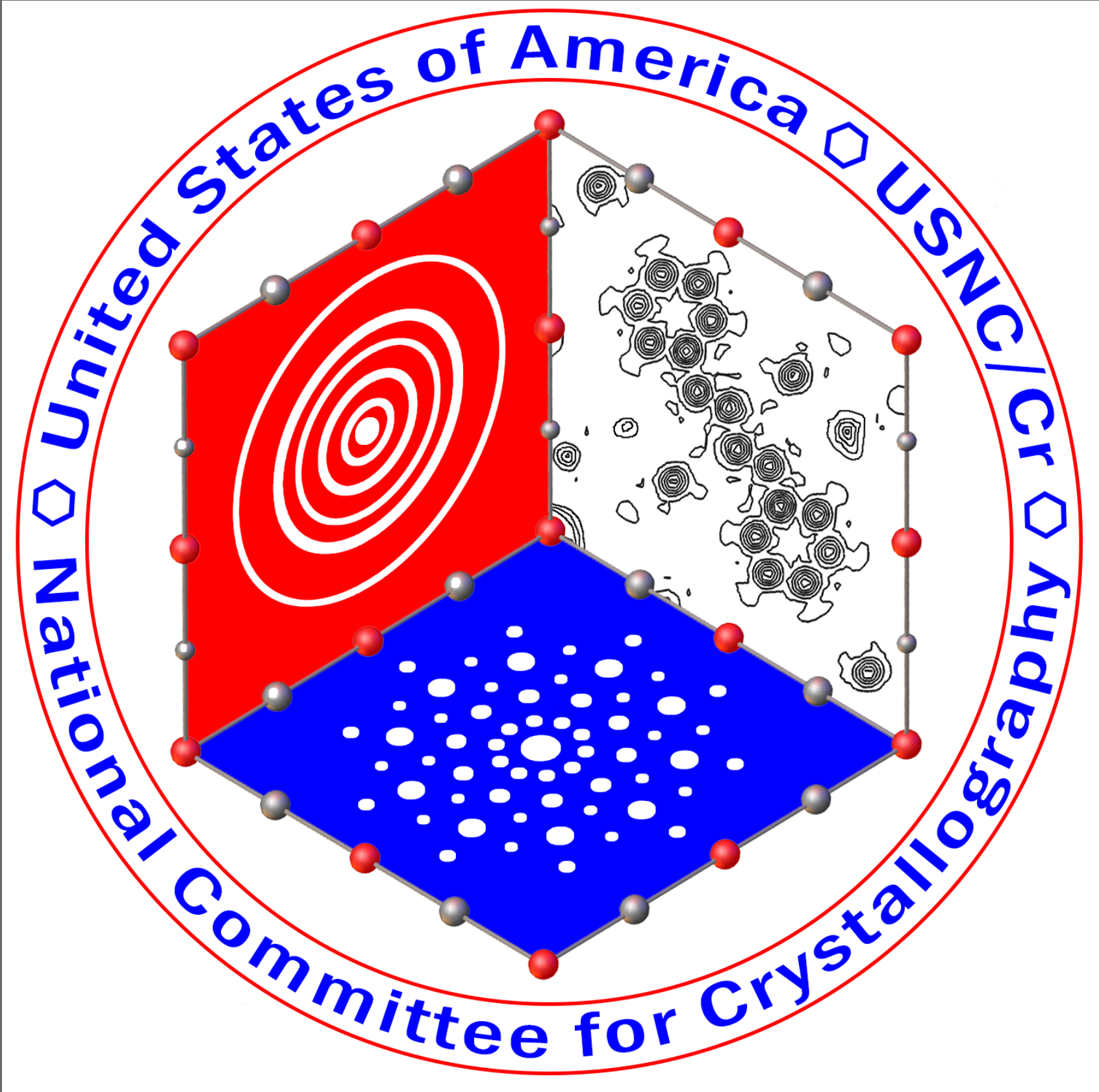
Realizing that the ACA membership was growing to include non-crystallographers practicing structural science, in 2021 ACA Council voted to add “The Structural Science Society” as a tagline to the traditional ACA logo. This change prompted the search for a new logo that would better reflect all scientists determining atomic-scale structure, not only those practicing crystallography and established the ACA Logo Committee.
When outlining the goals for the Logo Committee, Council recognized the long history associated with the original logo, which had been designed by ACA member Helen Berman over thirty-five years ago. The ACA Logo Committee was tasked with creating a new logo but also to honoring the old logo and history of the association.
After a long and extensive search, a logo was selected by the committee and approved by ACA Council in December of 2021. It is my honor, as the first Executive Director of the ACA: The Structural Science Society, to introduce the new logo:
For font, color and use details please check out the ACA Brand page.
There was a large list of elements and symbolism that the logo committee worked hard to incorporate:
- Pattern: The logo incorporated an illustration to reflect a diffraction pattern, a core component of structural science. The pattern can also be seen as a group surrounding the “aca: The Structural Science Society” type.
- Color: To honor the history of the original logo the committee stayed in the blue palette updating the original color and adding additional shades reflecting the various disciplines and techniques that the ACA hopes to be a home for.
- Font: The traditional font has been updated to reflect a a modern, clean style.
The Logo Committee and ACA Council thank all those who submitted designs for the new logo during the open call. The ACA is fortunate to have so many artists, designers, and creative individuals. We received so many logo entries that we were not able to individually thank each and every artist however we hope that anyone that submitted an entry knows how much we appreciate all of the submissions we received.
And finally, the Logo Committee deserves enormous recognition:
Joe Ferrara (Chair)
Lisa Keefe
Hanna Dabkowska
Chelsy Chesterman
Diana Tomchick
Ilia Guzei
The search for a new logo was a huge task to undertake. The full scope of the project (with dozens of submissions from members, over a hundred submissions from the designer call and then six months of development with a designer) was unanticipated and everyone here at the ACA thanks the committee to their devotion to the project.
Please know that transitioning to the new logo will not be an instant process and we appreciate your patience during our first ever logo evolution. Our website and internal documents will be updated first and then we will focus on updating outside sources where the logo resides, but we estimate the change to be complete in approximately six months.
Again, we are fortunate to have such a dedicated and artistic group of members and are looking forward to welcoming a number of scientists from a number of different disciplines to our society!
-Kristin H. Stevens-